Tuesday 20 September 2011

Go forth and Multiply

One of my favorite new features in Inkpad 1.4 is Blend Modes (you can find them under the Shadow and Opacity menu at the bottom of the menu). Blend modes affect the way the color of an object or group is transferred onto the objects below them. By default (Normal Mode), an object is opaque and blocks any objects that may be under it. Using blend modes you can change that. For now lets focus on one particularly useful blend mode – Multiply. I find this mode to be very useful for creating shadows. In the example below I've used Multiply to created the clock shadow and the wallpaper. Notice how the shadow blends into wallpaper.

Try out different Blend Modes and take note how they react with objects. Knowing how to use them may help give your Inkpad drawings the added edge you are looking for.


Saturday 3 September 2011

Blending Colors in Inkpad

Inkpad 1.4 is now available in the App Store. There are many fantastic new features to explore in this updated version. One of them is a powerful new color adjustment menu full of powerful ways to tweak and adjust colors you have applied to objects.

Below is an exercise to help you understand how the Blend commands work in the Color Adjustment menu. Click the figure to see larger version. See below the figure for a detailed breakdown of the instructions.


1. Draw a series of five circles horizontally
Draw a circle at the top left of your canvas. Don’t make it too large as you will be adding four additional circles to the right.
Duplicate it using Edit>Duplicate in Place. This will create a duplicate circle directly overtop the original circle.
Move the circle to the right (use graphic above as a loose guide for distance between circles).
Create three more circles by using the Edit>Duplicate and Transform Again command.

2. Duplicate the series vertically four times
Select the 5 circles.
Duplicate in place.
Move them down (using similar spacing as horizontal distance)

3. Set unique colors for the corner circles

4. Select and apply “Blend Horizontally” to the topmost row
Select all the circles in the top row.
Tap on the Color Adjustment menu and select “Blend Horizontally”

5. Select and apply “Blend Horizontally to the bottom row
Apply the same command to the bottom row

6. Select each column and apply the “Blend Vertically command
Select the column on the far left and apply Edit>Blend Vertically.
Continue the same for each of the columns.

Sunday 21 August 2011

Drawing a Neon Sign in Inkpad


With the Freehand Tool or the Pen Tool begin sketching out the shape you would like your sign to take. Take time to refine your lines by adding or removing anchor points (To add, use the Add anchor point tool. To remove, select an anchor point and choose Path>Delete Anchor Points from the menu).


Set the stroke width to the desired amount. Make sure you have rounded endpoints and corners selected as this will help simulate the illusion that these are tubes.


Turn on the drop shadow using the drop shadow menu. Offset=0. Blur=33.


Using the rectangle tool from the shapes menu in the Tool Bar, draw a color background shape and send to back using Arrange>Send to Back.


Draw a circle, send it behind the neon “tubes”. Set the fill of the circle to radial gradient and apply settings similar to example pictured above. Duplicate and move the radial gradient to create the illusion of glows behind the letters.


Next, select the neon graphics. Copy and paste on a new layer.

Outline the stroke by selecting Path>Outline Stroke.


Select Copy from the Edit menu.
Draw a rectangle around the outlined shape. Send the rectangle to the back using Arrange>Send to Back. Select the outlined shape and the rectangle and subtract the outlined shape from the rectangle by applying the Path>Subtract Front command.


Add a drop shadow to the selected shape. Set Offset to 0.


Next, paste the items from your clipboard and set Fill and Stroke to none. Select all the items in the current layer (Edit>Select All in Layer)


Remember that neon lights cast light. Add soft light glows on surfaces that may be near this object.

Thursday 4 August 2011

Marker Tutorial

This is a step-by-step tutorial for Inkpad users on how to create a drawing of a Sharpie style marker.

Marker

Begin by creating a new drawing (click the plus in upper right hand corner in the Gallery)
For this tutorial I selected Tabloid (11X17) in Landscape mode.

Next, turn on the grid and set "Snap to Grid" to on. Set the grid spacing to 0.25.


Select the pen tool and draw a shape similar to what is pictured below. This will be the body of the marker. If you need help drawing curves, check out the Pen Tool section in Inkpad help.


Next, draw the cap shape. See below for reference.


Continue to add detail like the marker tip.


Draw the cap clip.


Turn off the grid and snap to grid settings. Your drawing should look like this.


The next step is to rough in some colour. Tap on the fill menu at the bottom right of your screen and select basic colors for the marker.


Zoom in on the cap area. With the cap selected, open the fill menu and select the gradient tab. Use a linear gradient (selectable in lower left of Gradient Fill menu). Set the gradient orientation to vertical by moving the gradient control handles. Add six colour stops and space them out similar to picture below.


Next, move on to the cap clip. Similar to the cap, apply a linear gradient using similar colours to the main part of the cap. 


Quick Tip: With the cap clip selected,  sample the colour of the cap with the eyedropper tool. This will apply the gradient fro the cap. Delete the colors that are not needed and arrange as pictured below.


Move on to the body of the marker and use the same procedure as the cap - only with colors suitable for the marker body.


Next, we will add some fine detail. In the Settings menu, turn on "Snap to Points" and "Snap to Edges".


Next, we will create a highlight along the left side of the cap. With the rectangle tool, draw a rectangle along the left edge of the cap. The snap setting should allow you to do this quickly and accurately. Set the colour to a flat light blue. You might also play with the alpha (transparency) settings in the fill menu to ensure the highlight looks just the way you want.


Your drawing should now look something like this.


We will now create a small shadow from the cap onto the body. This gives the illusion that light is being cast from the cap onto the body. To do this (with your snap setting still on) draw a rectangle as shown below. Apply a gradient fill and orient the gradient control handles as shown below. Shadows can be tricky and may require a bit of patience to get looking just right. Add gradient stops and play with the transparency settings to get a subtle looking shadow.


Similar to the highlight on the cap, add one to the pen as shown below.


Shadow time. Create a circle with the circle tool and apply a radial gradient. Set the outermost color to 0% transparency.


Next squash the circle with the scale tool. With the circle selected, choose the scale tool from the tool menu. Begin dragging to scale, then add a second finger to distort the object with a non-uniform scale. It may take a bit of getting used to this, but once you master it you'll be using this technique a lot.

Quick Tip: This is a very quick way to add shadows to your objects and can be quite effective if used properly.

Send the shadow behind all objects by selecting "Send to Back" from the Arrange menu.


Now, this soft gradient shadow is nice.. but I would like to create a shadow cast from the marker. To do this, select all the components of the marker (not the shadow we just created). Copy and Paste them. They should create a duplicate copy on top of your artwork. Fill them all black.


Next, under the Path menu, select Unite.


This will create a single shape you can work with.


Using the same squash (non-uniform) scaling method we used for the soft drop shadow, scale the black shape. When you have scaled it to your satisfaction, send the object to the very back of the drawing using the Arrange > Send to Back command.
Play with the transparency settings in the Fill menu until you are satisfied with the opacity of the drop shadow.


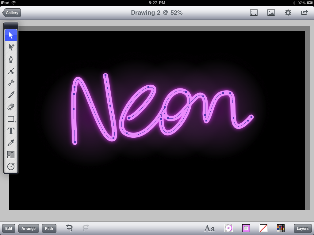
 Now on to the last of the pen details, creating a text graphic on the side of the pen. Using the freehand tool, sketch out the basic shape of the text. Set the fill of the object to None and apply a stroke.

You may need to refine the text graphic a little. Use the selection tool to move/shift the anchor points. There may be extra anchor points that need deleting. To do this select them and choose Edit > Delete. To increase or decrease text thickness adjust the stroke width value in the Stroke dialog box.


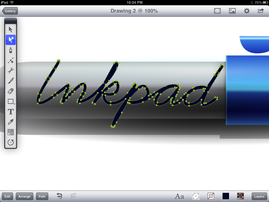
Once you are satisfied with the shape of your text graphic, select Path > Outline Stroke.


Your graphic should now be outlined like this:


Again, take the selection tool and shift/move the anchor points to give the text graphic some character. Apply a linear gradient fill (sampled from body of the pen) and set the values similar to what is picture below.


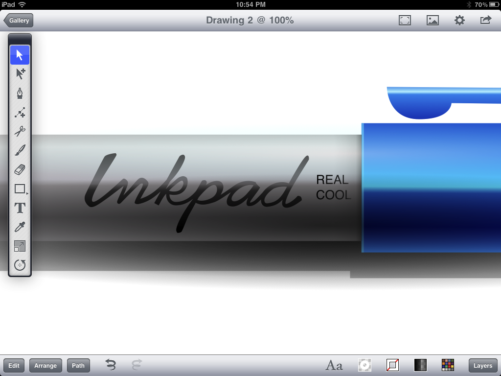
Almost there... add any finishing details you see fit.


If you like you can add a background. In this case, I used a linear gradient to give the drawing some warmth and depth.


That's it!
Have fun using Inkpad.

Thursday 28 July 2011

Create Light Rays in Inkpad

Here's a brief video tutorial on how to create light rays in Inkpad using radial gradients.


Inkpad - Sun Rays from Ron Letkeman on Vimeo.

Tuesday 21 June 2011

Make a beeline to Apple.com

My "Bee" Inkpad drawing has made it to the big show!... I was pretty stoked to find it featured as the Inkpad graphic under Educational apps on the Apple website. Click on the link and scroll down to Art, Music, and Creativity section - then click the Inkpad button.

Screenshot from Apple.com/education/apps


"Bee" was my first serious attempt at illustrating with Inkpad. Inkpad really is an amazing app.
If you're a professional illustrator or aspiring artist, Inkpad has plenty in store for you. You'll be impressed by it's feature set and clean interface. 

Wednesday 15 June 2011

Using gradients in Inkpad - Part 2

There are times when glows or shadows can be used to create contrast or definition to a drawing. One of the quickest and easiest ways to accomplish this is with a gradient. 
The gradient should contain two or more stops with the outermost stop set to complete transparency in order to blend with background behind it. Now, you might think that when you set the outer stop to 0% that color will blend consistently with the background. That is not always the case. Sometimes unexpected results occur. Read on to discover how to tweak the transparent color settings to make your drawing look fantastic!
If you look at the color of the radial gradient behind the flower in figure A, you will notice the stop on the right has identical values as the one on the left, but is set to 0% transparency. However, there is a noticeable halo around the edge of the gradient (see figure C and D as well).
The color of the transparent gradient in figure B has been tweaked to match the background color. Take note of the subtle change in the gradient preview area. There is a blueish tinge between the two stops. In this case, adjusting the color to dark blue helps eliminate the halo and blends the gradient into the background in a much smoother fashion.
Depending on the look you are after, the color of the halo can be edited and used to your advantage. Examples C and D illustrate how changing the color of the transparent color stop can warm or cool the glow behind the flower.


Experiment and see what you come up with! I'd love to see some of your work.


Sunday 5 June 2011

Using gradients in Inkpad - Part 1

Vector art lends itself very well to a graphic, flat style - flat lines, colors, shapes (Figure 1A).  This may be the style of art you are trying to produce; however, here’s another option that will help bring your artwork a sense of volume. Gradients. If used properly, gradients can help your art produce a sense of 3 dimensions.  
There are two types of gradients - linear (gradually changing straight lines) and radial (gradually changing circles). I will be focusing on radial gradients in this post.
You can apply a gradient in Inkpad by creating/selecting an object, tapping on the Fill button and selecting the gradient button at the top of the Fill panel. Although Inkpad is only limited to 6 color stops (color changes) that is enough to create some fantastic artwork.
Below (Figure 1) is an illustration showing the conversion of a mushroom from a flat 2D style to a 3D look using only radial gradients. Each step shows the gradient colors used. You can also see where I’ve placed the gradient control handles to maximize the placement of the gradient

A - Original art
B - Radial gradient applied to mushroom cap
C - Radial gradient applied to mushroom cap spots - with lightest color removed to keep spots visible slight tweak to control handles. Stroke removed
D - Radial gradient applied to stem. The top of the gradient is darker shade to simulate shadow cast from the mushroom cap. Stroke removed
E - Radial gradient created to simulate drop shadow. This is one of my favorite techniques in Inkpad. To create this effect draw a circle and apply a radial gradient. Center the gradient by moving the control handle for the first color stop to the center of the circle. Next, use the scale tool to flatten the circle. This can be accomplished by performing a non-uniform scale on the circle (hold down a second finger while dragging the scale tool). By this stage the mushroom is starting to look pretty good and you might be tempted to stop here, however, there are a few additional steps you can take to make the art  more zippy. You can see the steps for step F in Figure 2.


F - Cap Highlights - There are 3 radial gradients added on top of the cap as highlights. These were created by setting the gradient colors to go from the highlight color in the first stop to 100% transparent in the second stop.
Stem Highlights - 2 highlights, created in a similar manner to the cap highlights, are stacked on top of the stem. The one on the left is larger as it illustrates the light cast by the main light. The second highlight represents bounced light and helps define the right side of the stem.
Glows & Shadows - additional glows and shdows were added to the mushroom to further enhance the 3D look.
I continue to be very impressed with the features offered in Inkpad. In fact, all artwork in this post was created on iPad using Inkpad.
Stay tuned for Part 2.

Saturday 28 May 2011

Curious Jelly

Curious Jelly by ron.letkeman
Curious Jelly, a photo by ron.letkeman on Flickr.
This drawing was created by experimenting with the new shadow feature in Inkpad (v1.3).
To create Inner glow effect:
1. Draw or select a shape to which you would like to apply the inner glow

2. Copy the shape
3. Draw a bounding box around the shape created in step 1. The box must be larger than the shape. See below.

4. Send the box behind shape and select both objects
5. Subtract the shape from the box using Path>Subtract Front

6. Turn shadow on (set offset to "0" and blur to desired amount)
7. Paste previously copied shape
8. Set stroke and fill to none
9. Select all 3 objects and apply mask (Path>Mask)

Voila! an object with inner glow.